Here’s a really fun puzzle spread illustration created for the October 2022 issue of Chirp Magazine, depicting the Fiddler Festival in Alsace of France! A lot of liberty is taken here so kids get a glimpse of the real thing, but can find letters hidden in the scene, among other things to do within the scene! My thanks to those at Owl and Chirp for the enjoyable project!

Vintage Book Week 23 Challenge!
A group of illustrators hosted a challenge called “Vintage Book Week 23” on Instagram, giving folks four vintage books to over the course of a week to reinterpret as they wished. One could treat it as a Draw This In Your Style (#dtiys) or do a completely updated version. I treated them more as a DTIYS, which gave me opportunity to try out brushes, etc. I love those challenges to work on things like that! So I am posting here my versions, as well as the original book covers, for comparison!


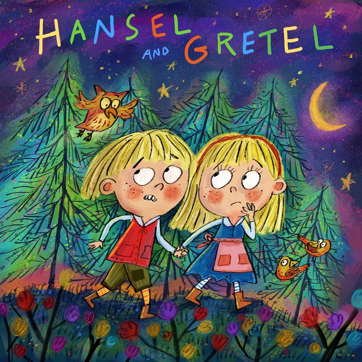
Oh! I did another version of the Hansel and Gretel book cover, closer to the original. I didn’t like it much at first, but it’s grown on me!
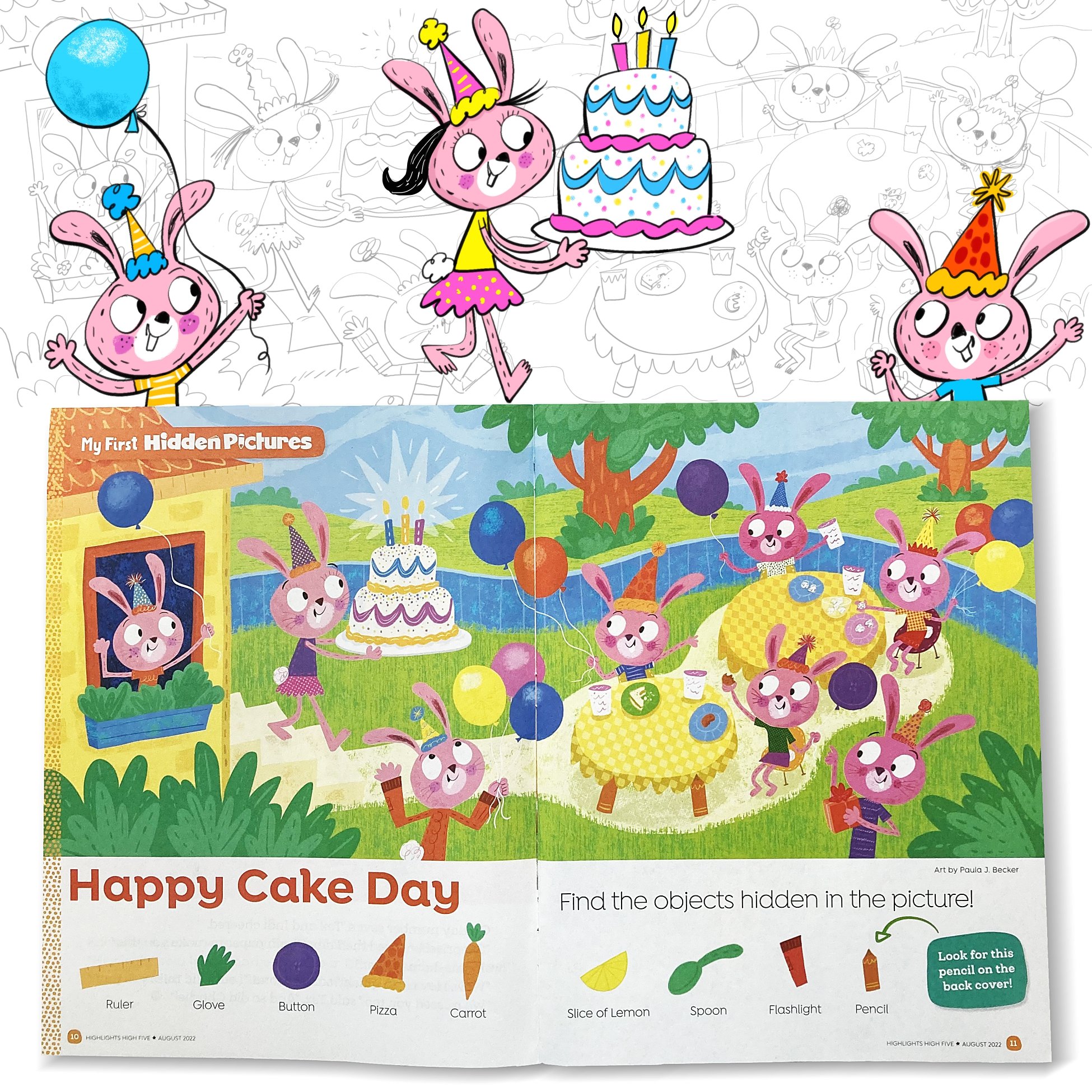
High Five Magazine--August 2022 Issue: "Happy Cake Day!" Hidden Picture Puzzle Spread!
This Hidden Picture puzzle is in a little bit of a different style than my line work. I like to mix it up here and there! This was published in the August 2022 issue of High Five magazine. See if you can find the hidden pictures! There’s a key for you, if you need the help!
My thanks to all the fine editors, art directors and designers at Highlights for Children and High Five magazine for the fun project!
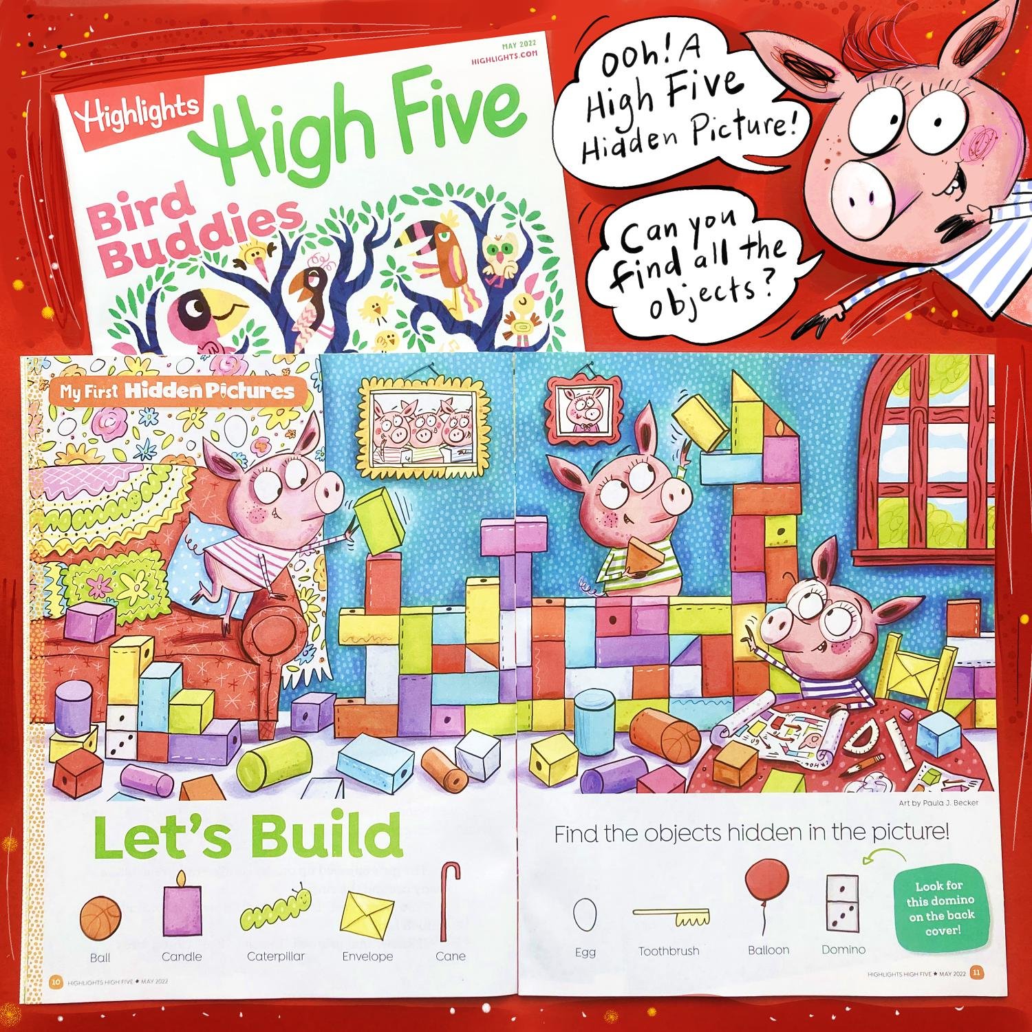
High Five Magazine--May 2022 Issue: "Let's Build" Hidden Picture Puzzle Spread!
More catching up! This was a Hidden Picture puzzle I created for Highlights. It ended up in the May 2022 issue of High Five magazine! It was a lot of fun to put together and turn it into a Three Little Pigs scene. I envisioned that the pigs built block houses when they were little piglets, all before they built their houses that Wolf blew down. Except the brick one. I wonder which of these piglets built that one…? My thanks to Highlights and High Five magazine for the fun project to work on!
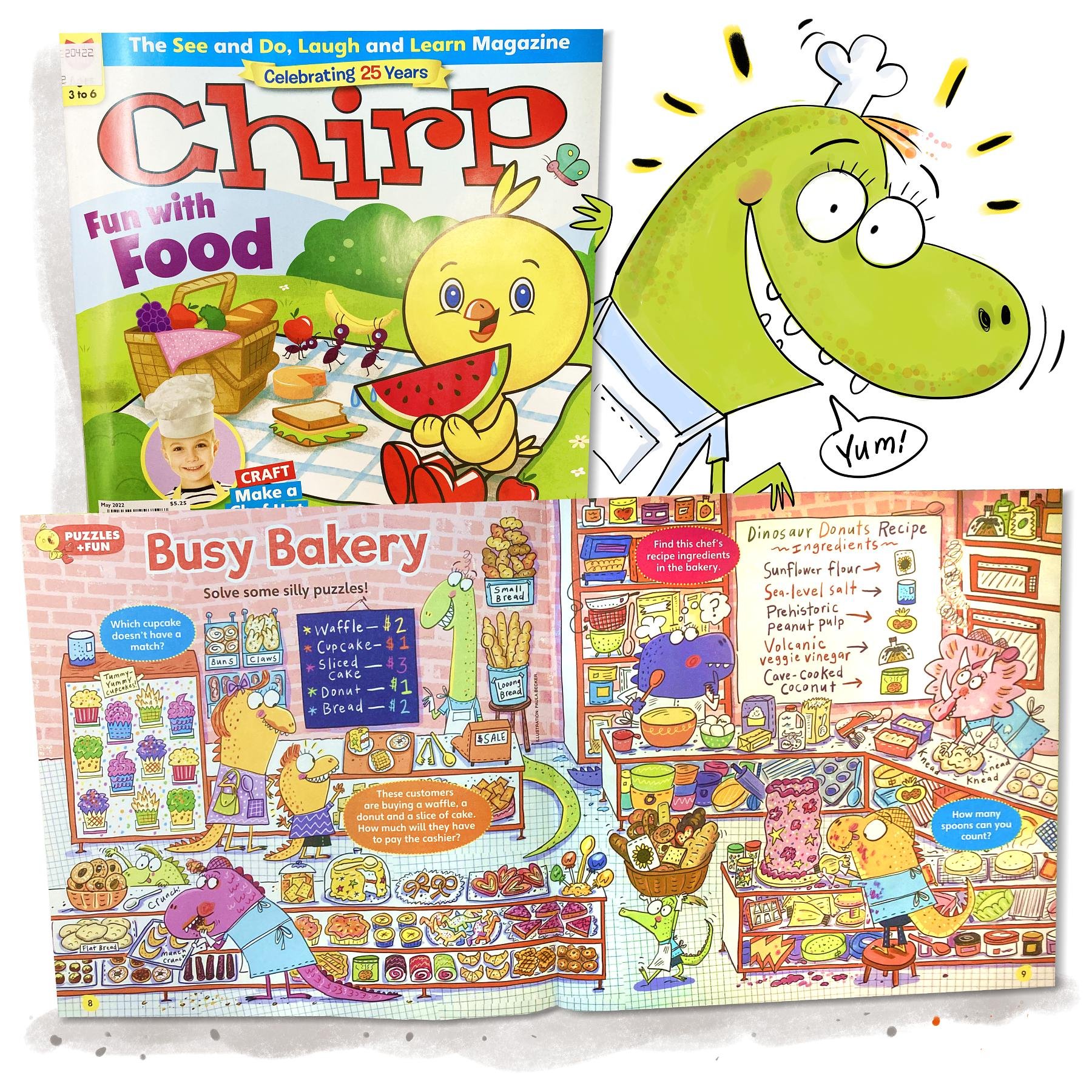
Chirp Magazine--May 2022 Issue: "Busy Bakery" Puzzle Spread!
I’ll be doing some catching up of several illustration projects that have been clamouring to be posted, starting with this fun scene for Chirp Magazine! My thanks to the great editors, art directors and designers who send me these super fun jobs!
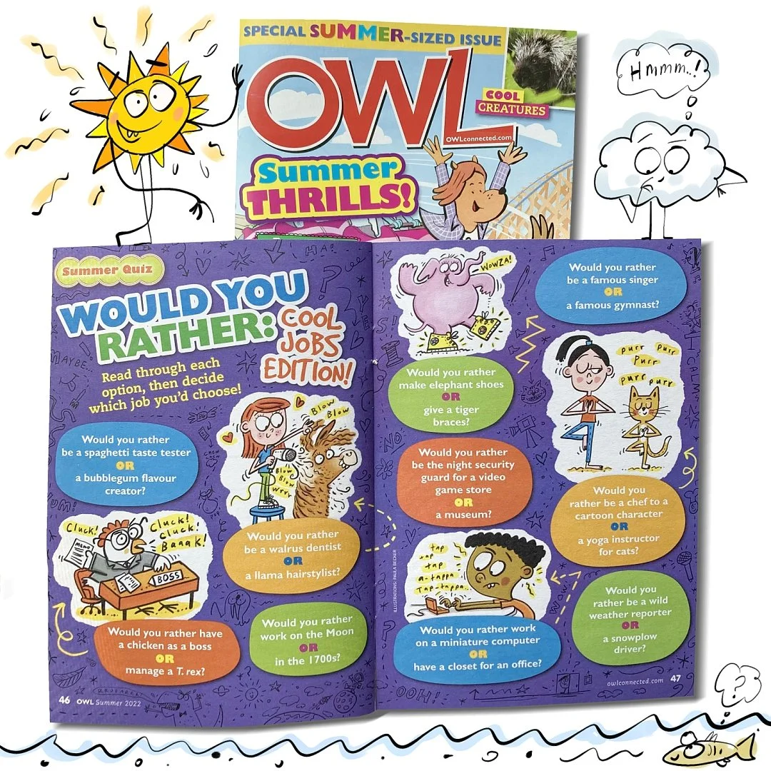
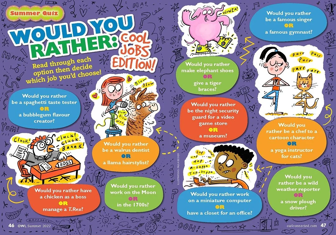
Owl Magazine--Summer 2022 Issue: "Would You Rather...." Spot Illustration Cartoons
I loved working on these super fun cartoon spots for Owl Magazines Summer 2022 issue! I did the line art background, too. I think the kids must be laughing at the silly choices of occupations they have come up with here! Below are some samples of the layout and spots!
Owl Magazine--April 2022 Issue: "Fooled You!" Spot Illustration Cartoons


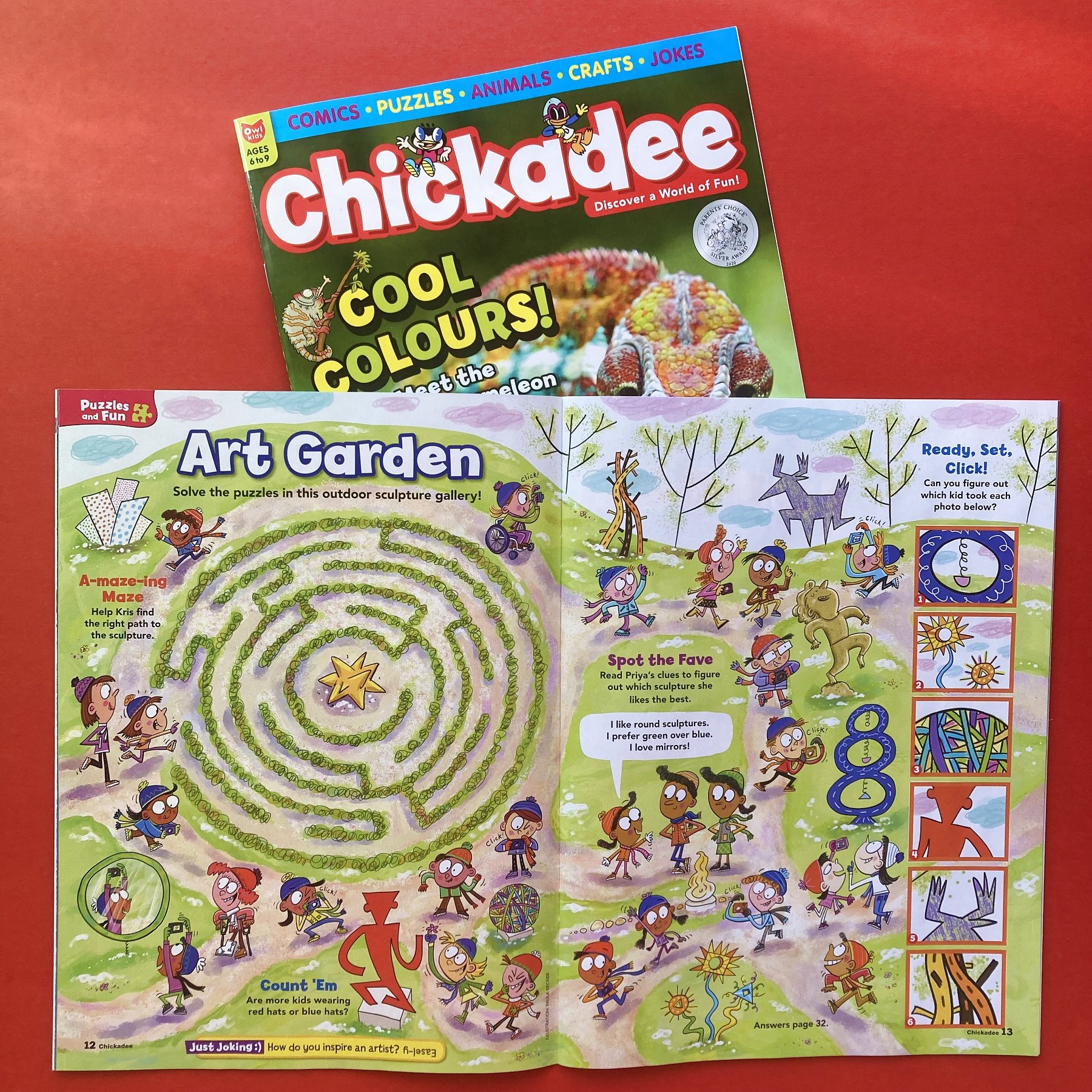
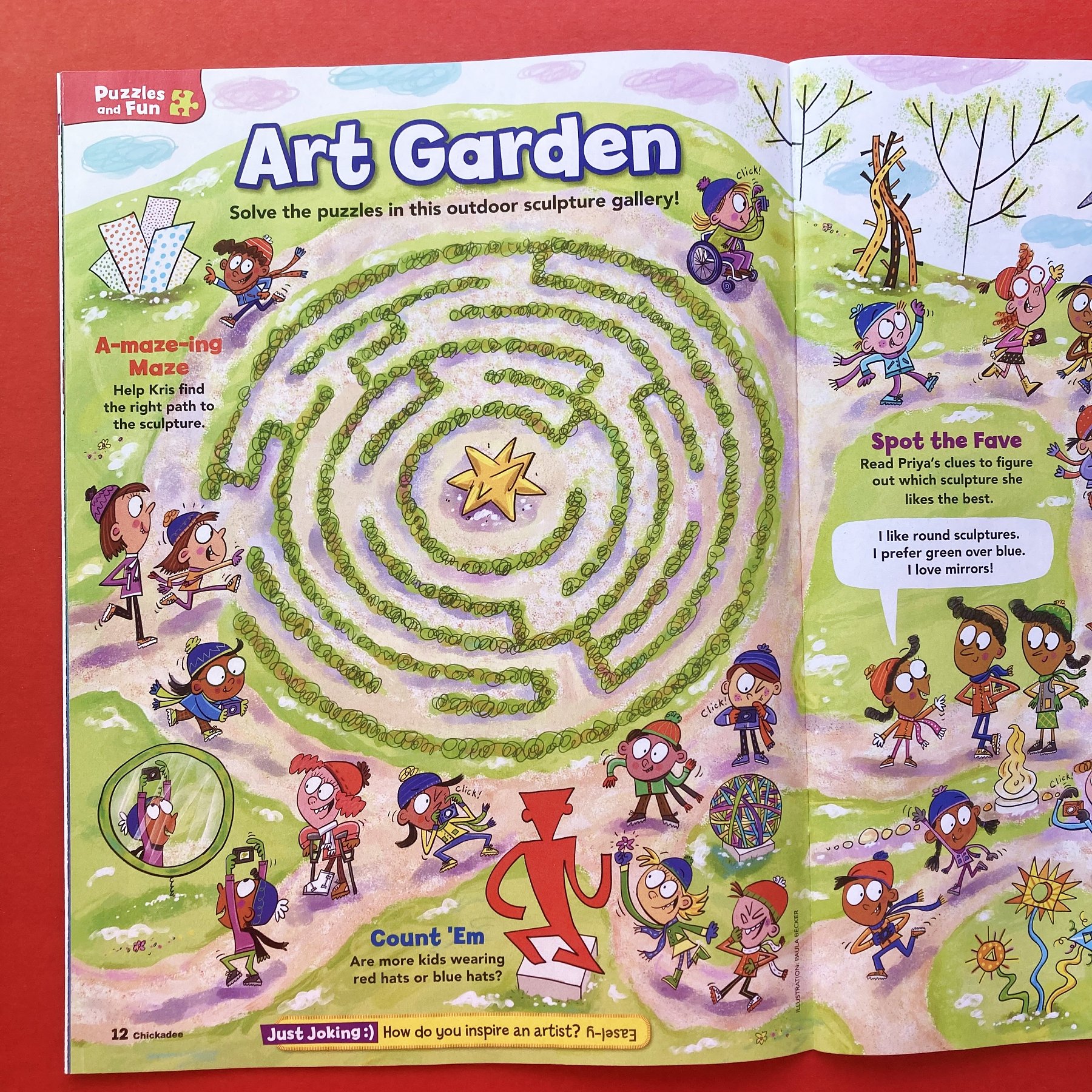
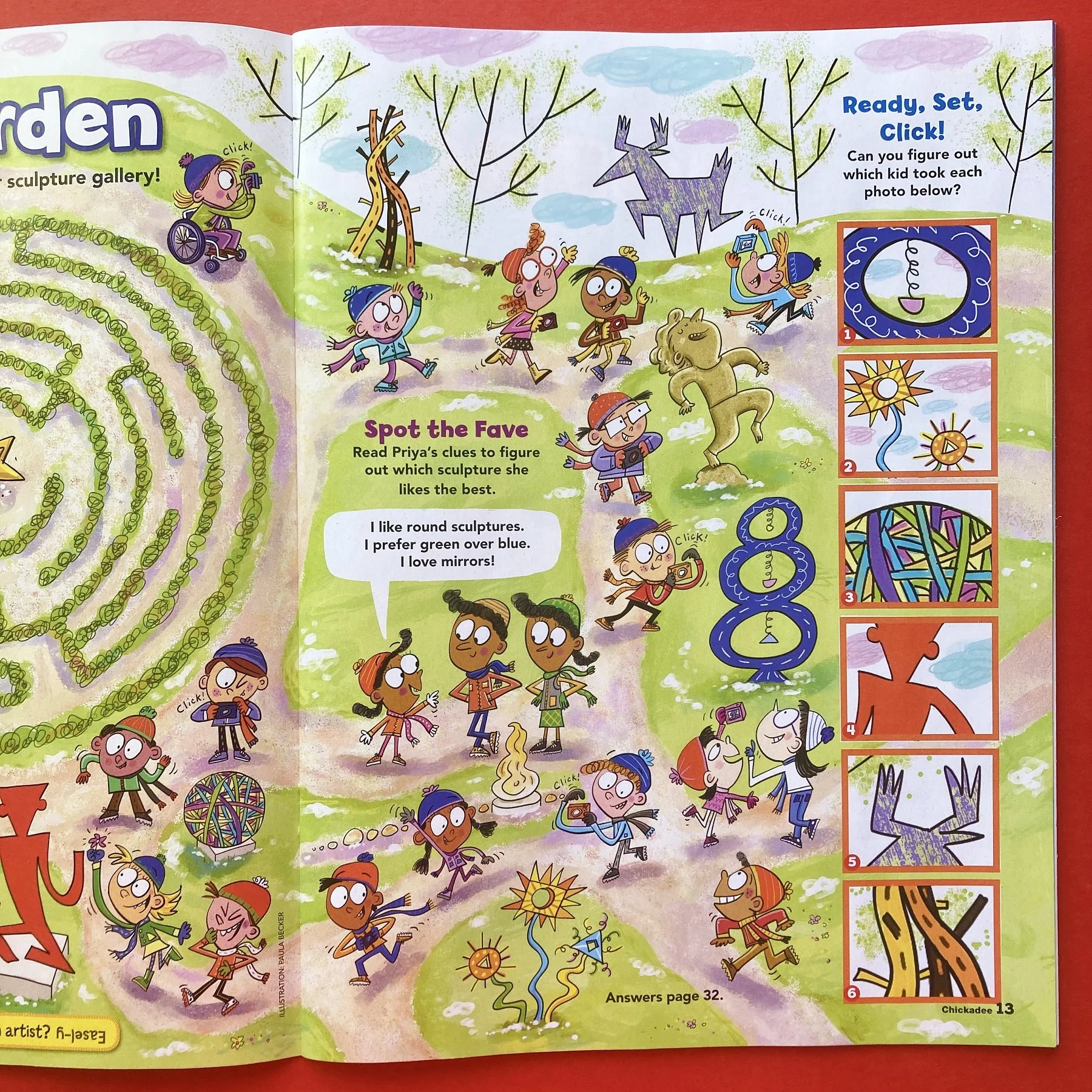
Chickadee Magazine--March 2022 Issue: "Art Garden" Puzzle Illustration

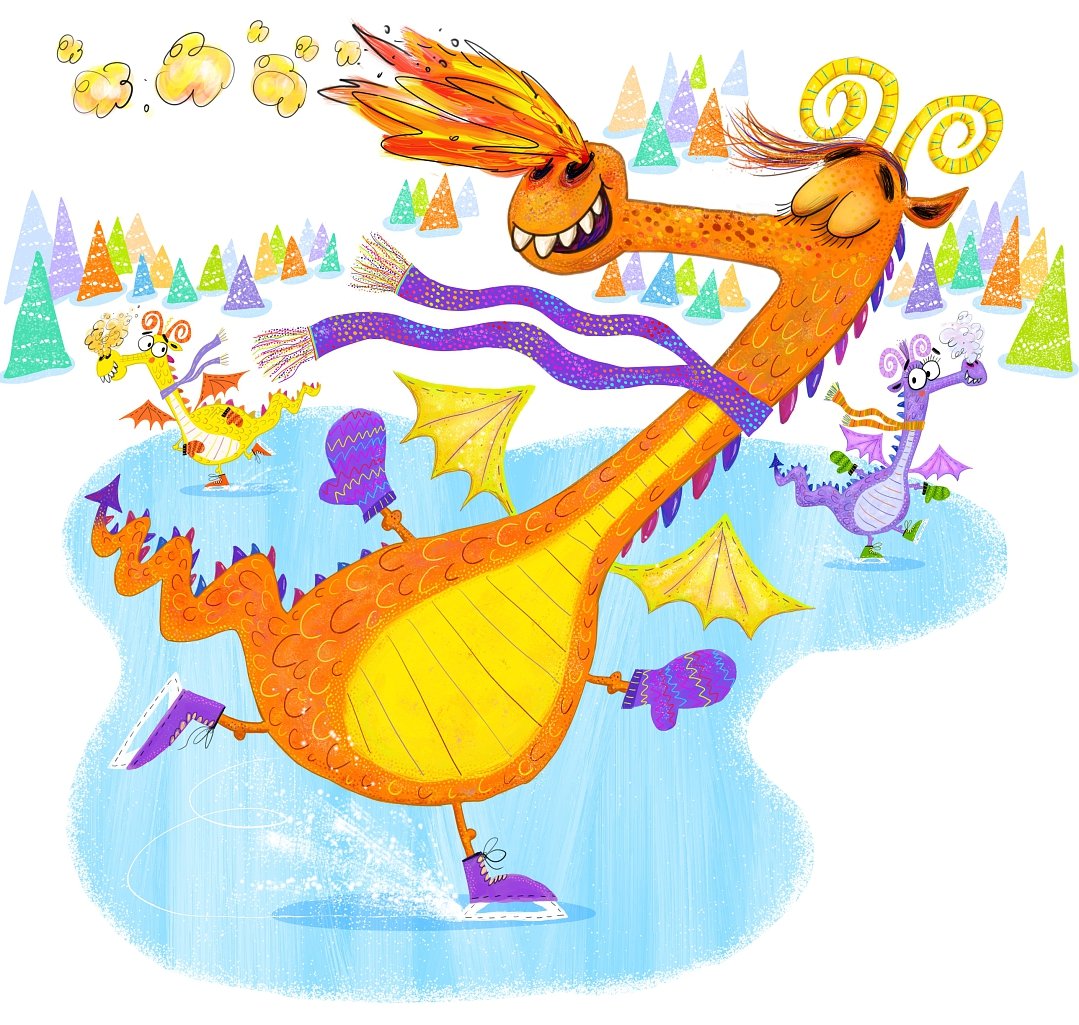
Something New! High Five Magazine Spread -- "Dragon Moves"
It was really fun to illustrate this dance like a dragon interactive spread for the January 2022 issue of Highlights for Children’s High Five magazine. Thank you, High FIve! I Hope the kids get a good bit of exercise as they groove to dragon’s moves!


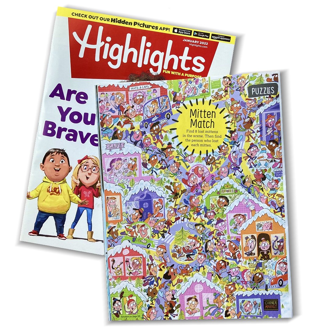
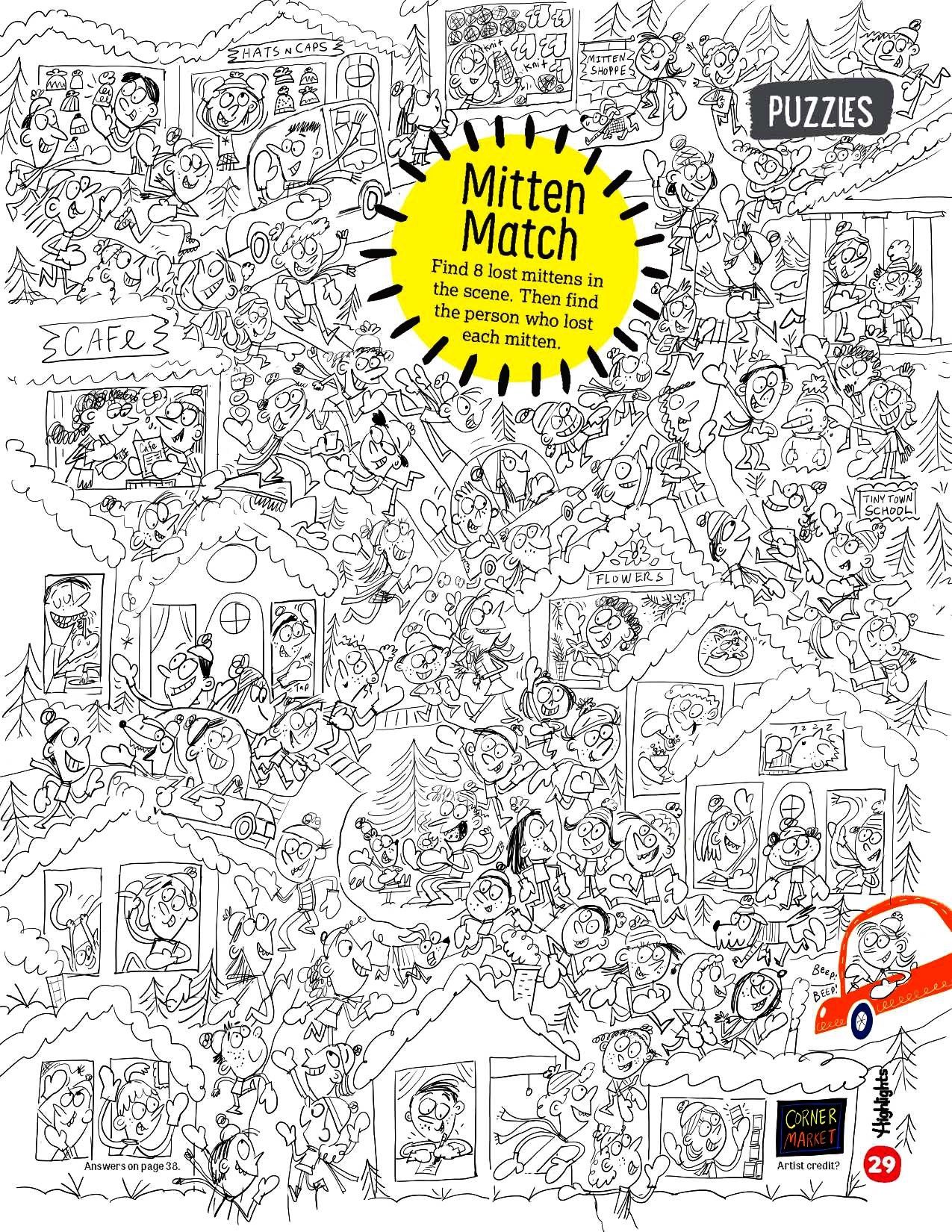
Something New! Highlights Magazine Puzzle--Mitten Match!
I had the pleasure (and fun!) to illustrate this puzzle for the January 2022 issue of Highlights magazine, depicting a VERY busy village with several people missing their mittens. Kids are supposed to find the mitten in the scene and figure out who’s mitten it is. Below is some samples of these project. Thanks for stopping by!


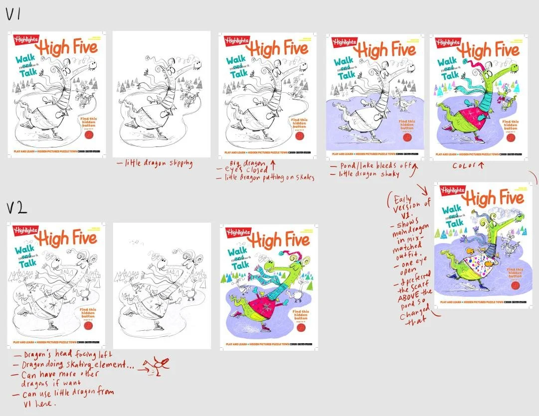
Something New! January 2022 High Five Cover!
It’s been a while since I posted as I’ve been quite busy with several fun projects, both for clients and for myself! Happy New Year! It’s time to catch up and post some items that have finally come out in print! This cover for the January ‘22 issue of High Five magazine was working on over a year ago. Seems like forever but here it is on the cover. I had a fun time working on it, and I appreciate the opportunity to start the new year with such a nice item to post about. Below I have pics of the cover, and the original illustration before it got pared down and changed a bit. I also included some early sketches I sent to the client.

Something New! Chirp Magazine: Take a Trip--A Space Museum Illustration
I had the pleasure to illustrate this October 2021 issue of Chirp magazine’s “Take A Trip”, featuring the Comosphere Museum in Hutchinson, Kansas. I had to really think about how to rearrange the reality of the space and most important items (lunar rovers, space capsules, etc.) to fit on a two-page spread! I did a lot of research and picture browsing to get things fun and cartoony, but with enough accuracy to be distinct to the items/space. All in all, I am pleased how it turned out! And the entire issue is about space so chocked full of interesting things to learn in a fun and informative package! Thank you, Owlkids, for your outstanding work, and letting me be a part of it so many times!
Below is the magazine spread, the original, and each page close up.


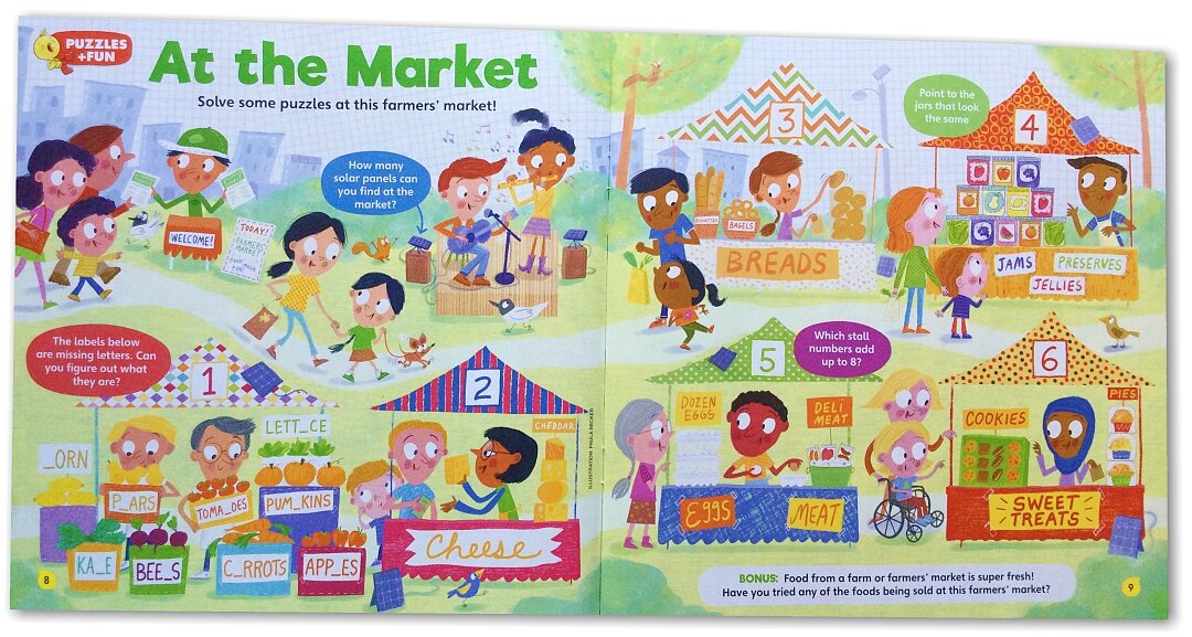
Something New! Chirp Magazine & Farmers' Market Puzzle Spread!
I get such fun projects! This is a magazine spread illustration for Owl Publishing’s Chirp magazine, the April ‘21 edition, depicting a farmers’ market, with a few puzzles built in. I debated over whether to use an outline/cartoonish style or not, and in the end went without. I like working both way and this one I felt would be just fine to do either way, so it was just a in-the-moment call. Since it’s still the covid era with restrictions, we opted to not do a large crowd, so that kept it simpler. I also added fun textures all over. Hope kids enjoy the puzzles and learn! I always do!


Something New! "That's Silly!" Puzzle Spead-Hardware Store Scene
Wow, what a challenging and fun illustration to do for High Five magazine’s March ‘21 issue! A “That’s Silly!” that’s featured in a hardware store made for some really fun—and silly!—things to show. I am including the sketch here, as some things changed a little for the final (The baking bear replaced the grandmother). Other things adjusted along as I got to the final art, too, as it usually does. Anyway, I hope the kids enjoyed the scene and had a good laugh here and there! Thanks, Five High /Highlights, for this fun project!


Something New! High Five Magazine Spread: "Art With Friends"
I’m a little behind with keeping up with the blog and posting new, printed work, but hey! This two-page spread hidden picture illustration was created for the December 2020 issue of High Five magazine. I enjoyed working out the bedroom this little boy was making art in! And how cute, that his “friends” are stuffed animals! They seem making some nice art there—all of them! I hope the kids enjoy the illustration, as well as finding the hidden items in the spread. Thanks, High Five!


Something New! Highlights Hidden Picture for Christmas!
I was also asked to create this inside illustration for the same Hidden Picture book! Such fun to work on these elves as they decorate a Christmas tree. See if you can find the hidden pictures that are on the list! Have fun!

(C) Highlights for Children
Something New! Highlights Hidden Picture Cover & Puzzle!
I love all the projects I do for Highlights for Children, and this time, I had the opportunity to do a little something different—a reverse hidden picture, which would also be used for the cover! This is a Christmas holiday themed book so Santa in his sleigh being pulled by reindeer was the theme! It was a bit novel to do this in reverse, but I think it turned out well. There are many other illustrators who contributed their talents to the book as well! This is an item any child would enjoy, I am sure! Maybe even adults! Thanks again, Highlights!

Something New! High Five Magazine Spread: "School Supplies"!
It’’s always special to do anything for Highlights For Children, and when the art director asked me to create an illustration spread for the September 2020 issue of High Five magazine, I of course said yes! This is for their “That’s Silly!” segment in each magazine, where kids find as many “silly” items in the scene as they can. It is a good educational tool which is fun and humorous as well! Below are samples of the spread as well as closeups. I hope the kids had a few laughs as they looked over this scene! I know it was pretty fun to create!


Something New! Grassi Lakes Hiking Trails Illustration Spread
This illustration for the summer 2020 issue of Chirp magazine took a lot of turns due to the Covid-19 pandemic, changing subject matter twice before it became what you see here. My poor clients! We all survived and in the end, it was decided the Grassi Lakes Hiking Trails in Alberta, Canada would be showcased! It was a fun challenge to look at the map and work out a stylized illustration of place geographically. I have the view looking north to south. Anyway, what a great place to visit and hike, see the falls, and rock climb among many other activities. Here’s the official link to the provincial park. I hope to discover and enjoy it myself some day! Oh, and due to pandemic, I haven’t been able to get a hard copy of the magazine, so these digital files will have to do for now. You can see the AD’s notes in the layout!


(c) OwlKids
Something New! Magzine Spot Illustrations/Cartoons -- The Great Bear Rainforest!
It’s always a pleasure to work with Owlkids Publishing and Owl magazine on their many educational projects. This time, I did a spot illustration/cartoon & map for an article about The Great Bear Rainforest, located in British Columbia, Canada. It looks like a wonderful place to check out and perhaps hike and enjoy other activities. Someday I will go! In the meantime, I hope the kids enjoy learning about this place, and that the bear cartoon and map add to their fun of learning! Samples are below. The second bear was one of the sketches I sent to see what would be best to put in that spot. The bear sitting up was chosen, but the other is just too cute to not include! And please check out Owlkids and all the books and magazines they have to offer! Your kids will be glad you did!


